Design.Wine.Dine.

  • About
  • Design
    • Interiors
    • Events
    • Floral
  • Wine
    • Cocktails
  • Dine
    • Fall
  • Life
  • Travel
  • Contact
  • Facebook
  • Instagram
  • Pinterest

#ONEHOPEHoliday / Snippets from last week…

July 28, 2014

photo 1

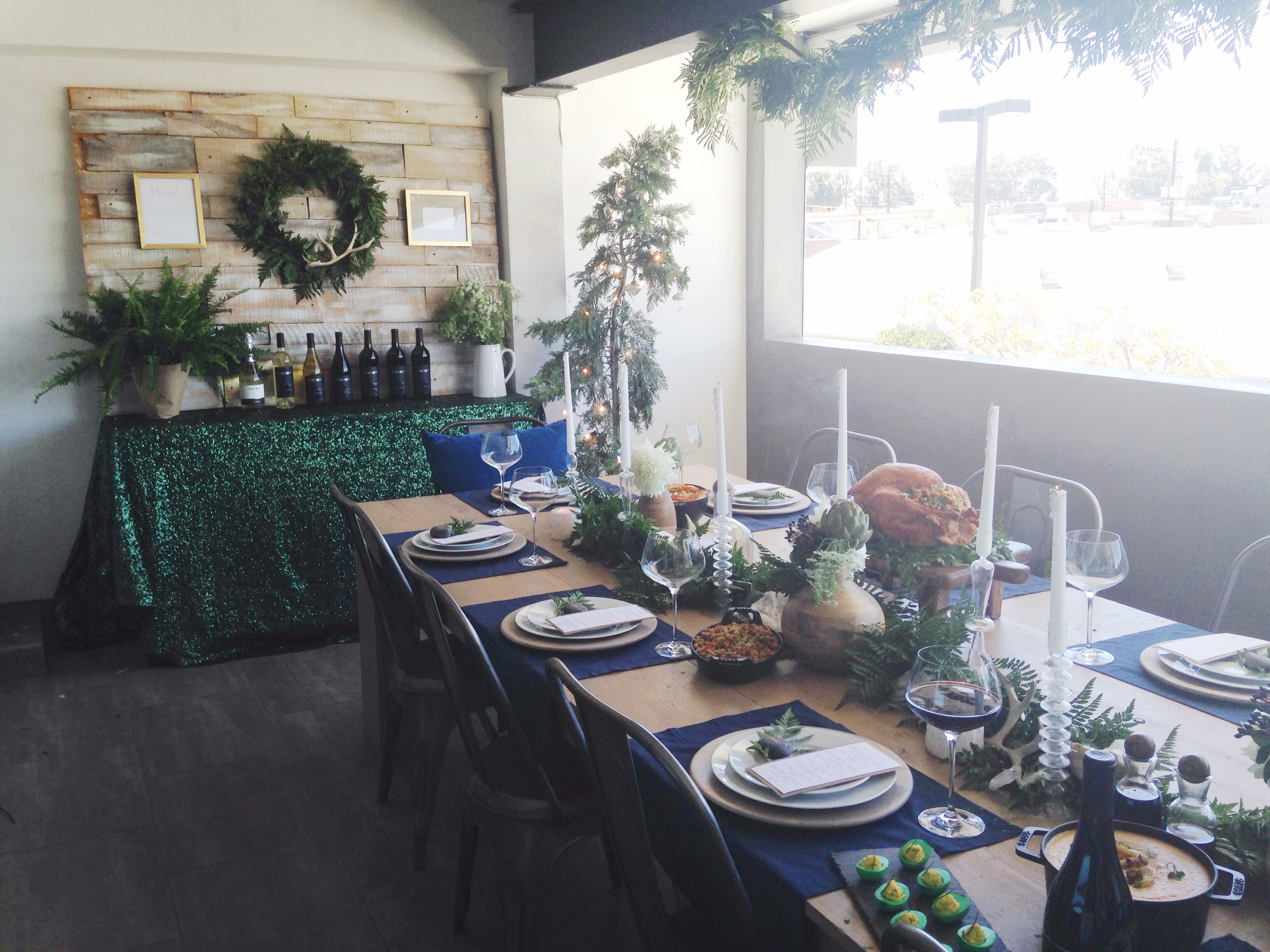
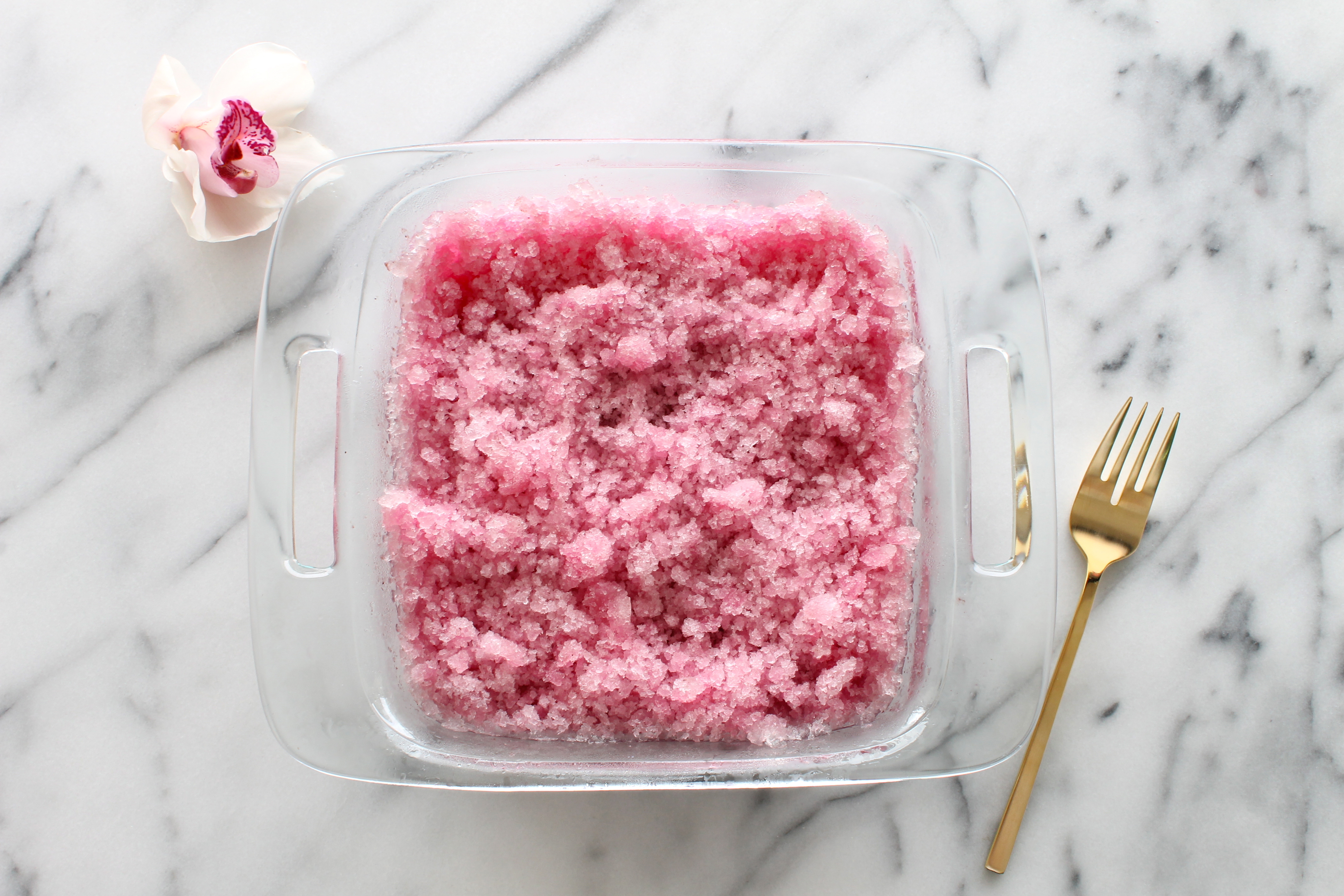
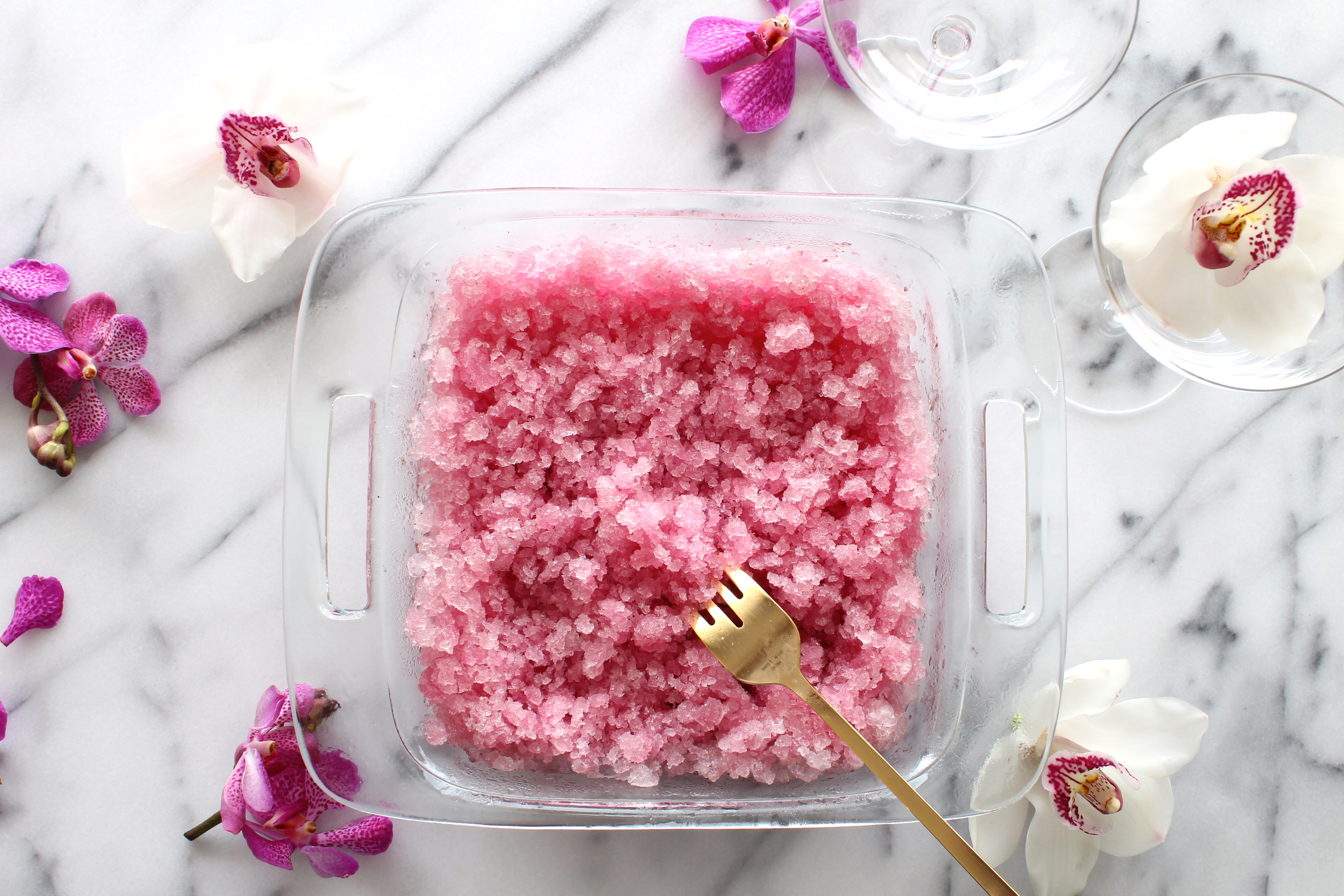
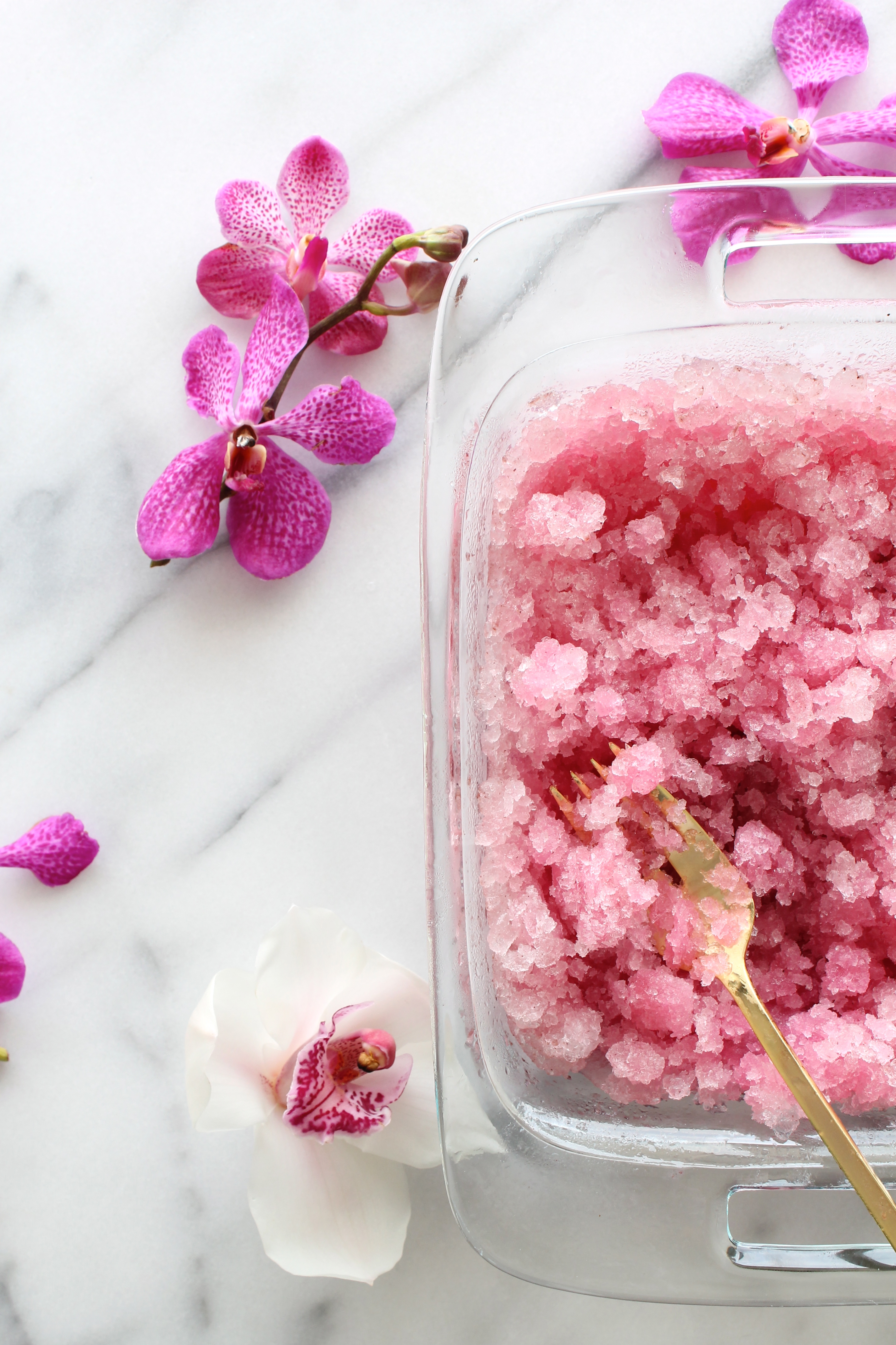
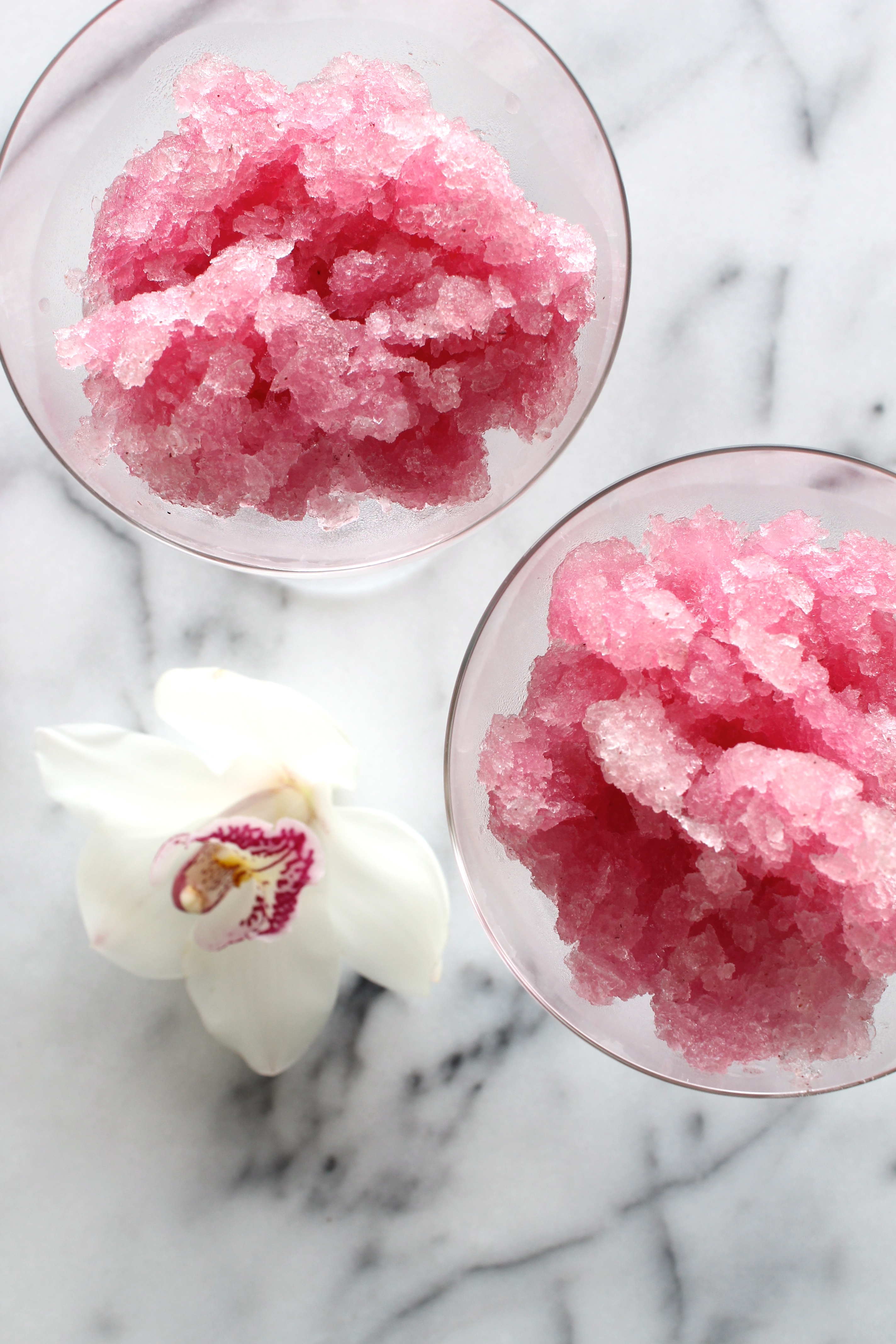
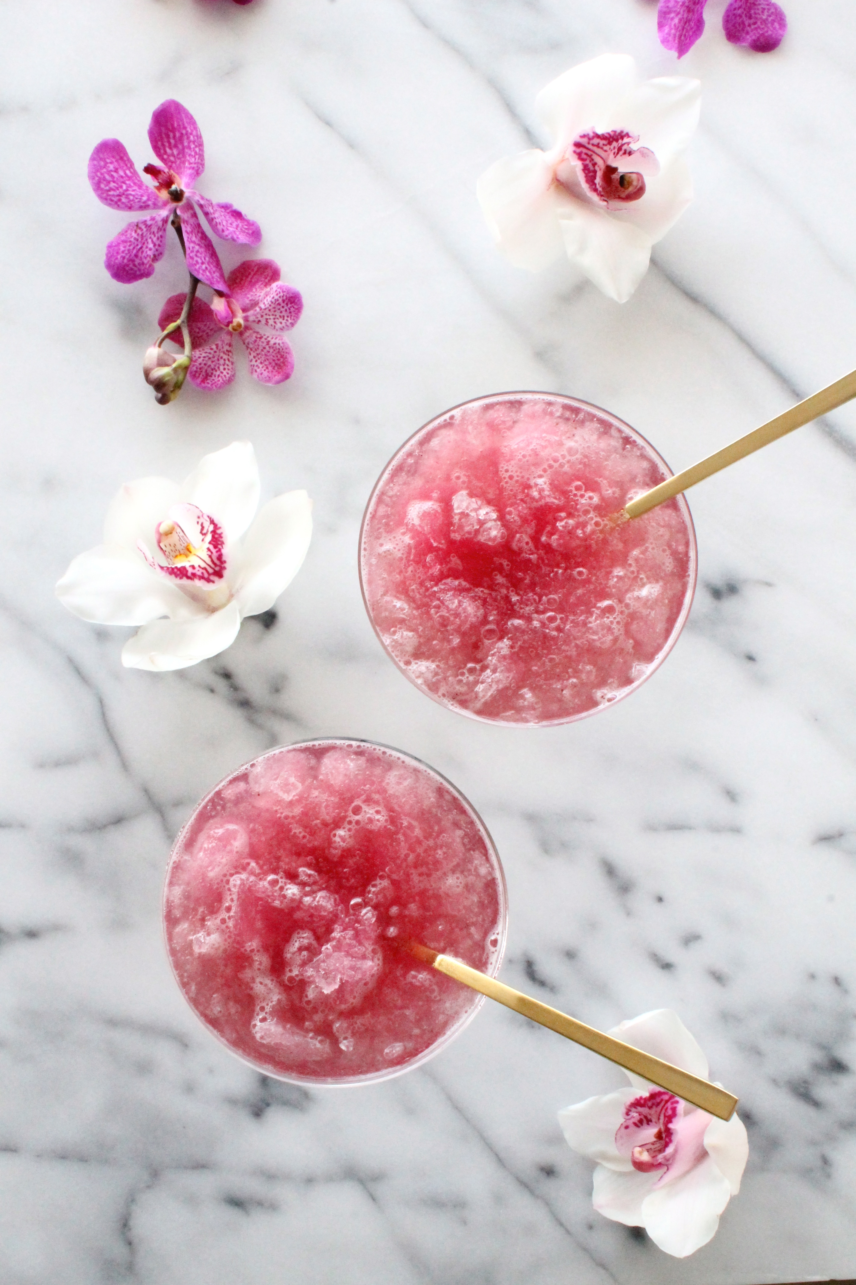
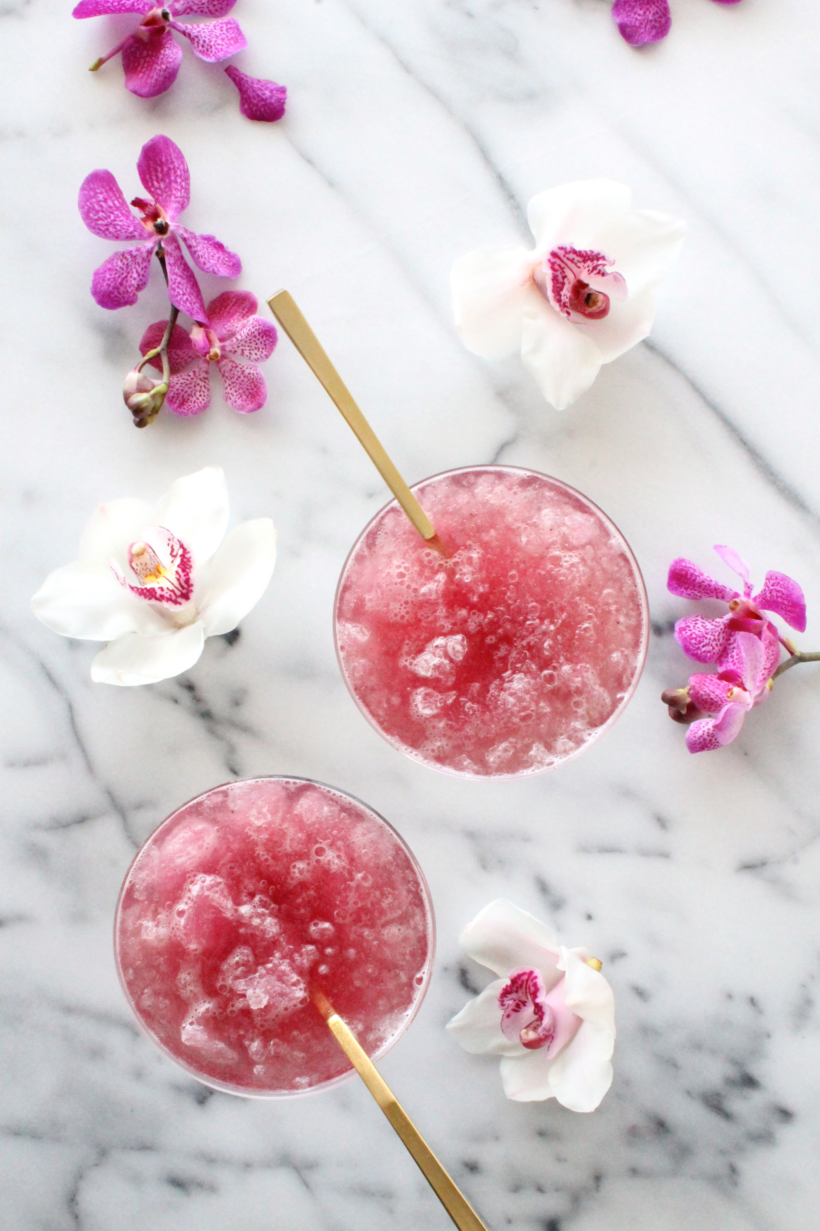
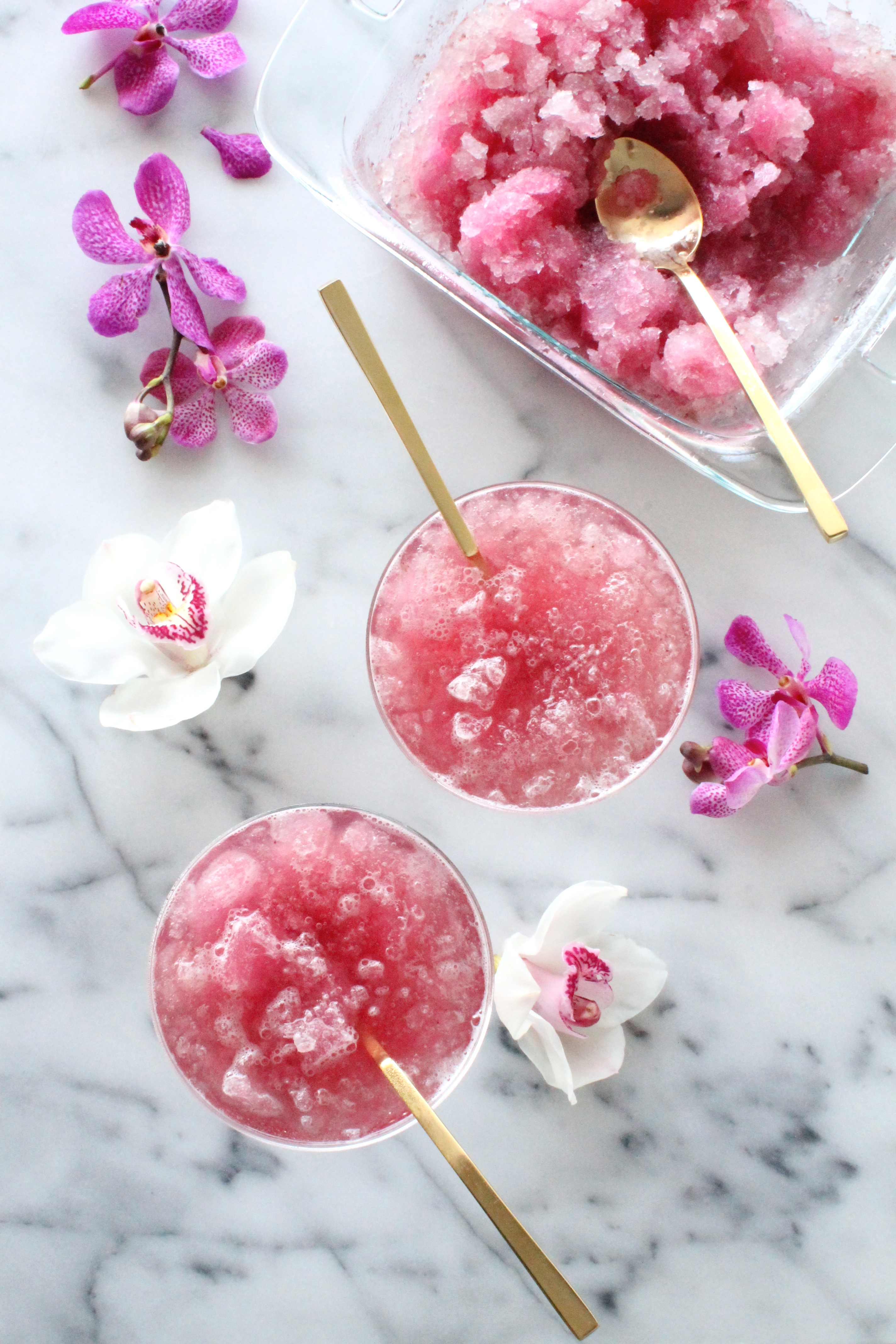
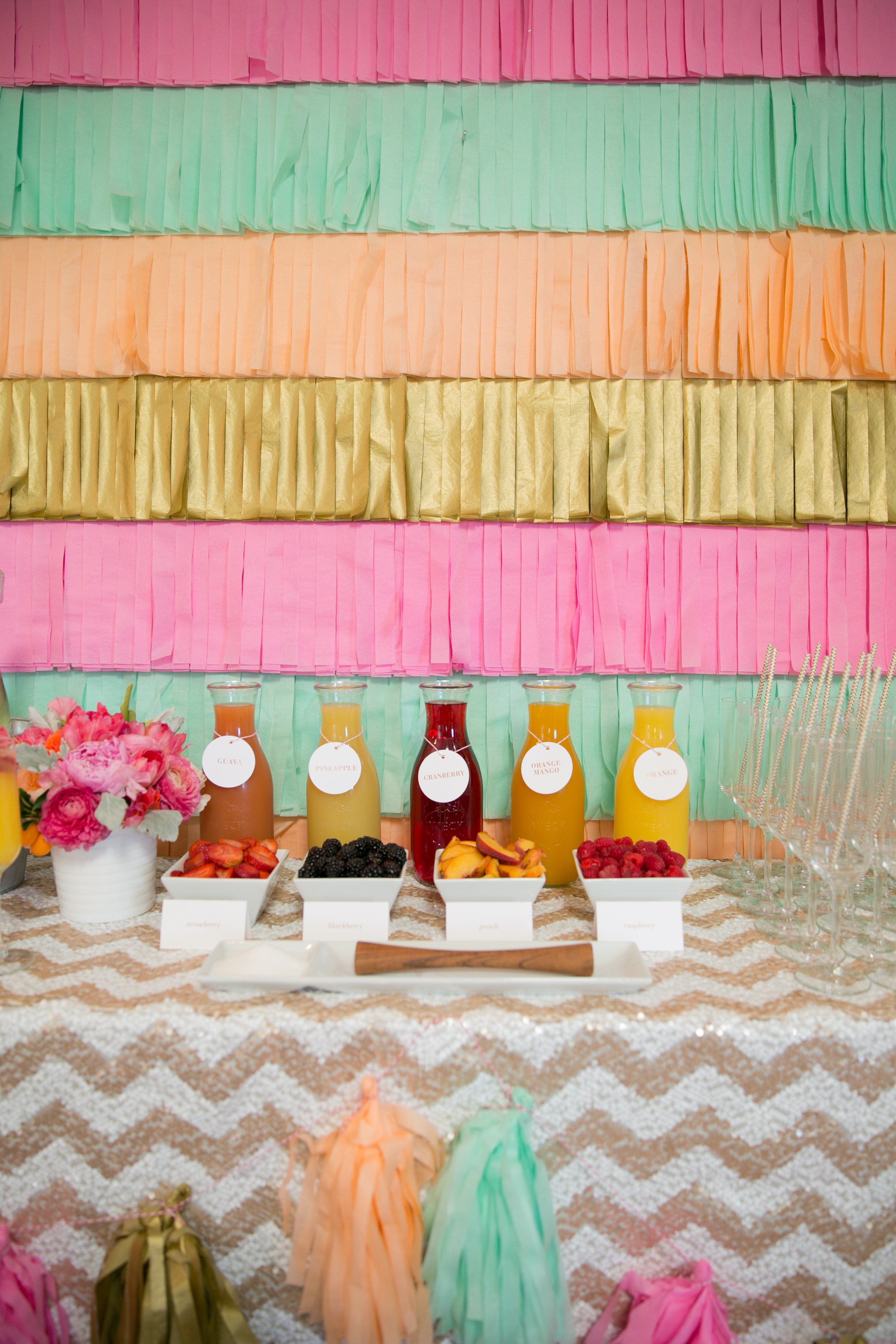
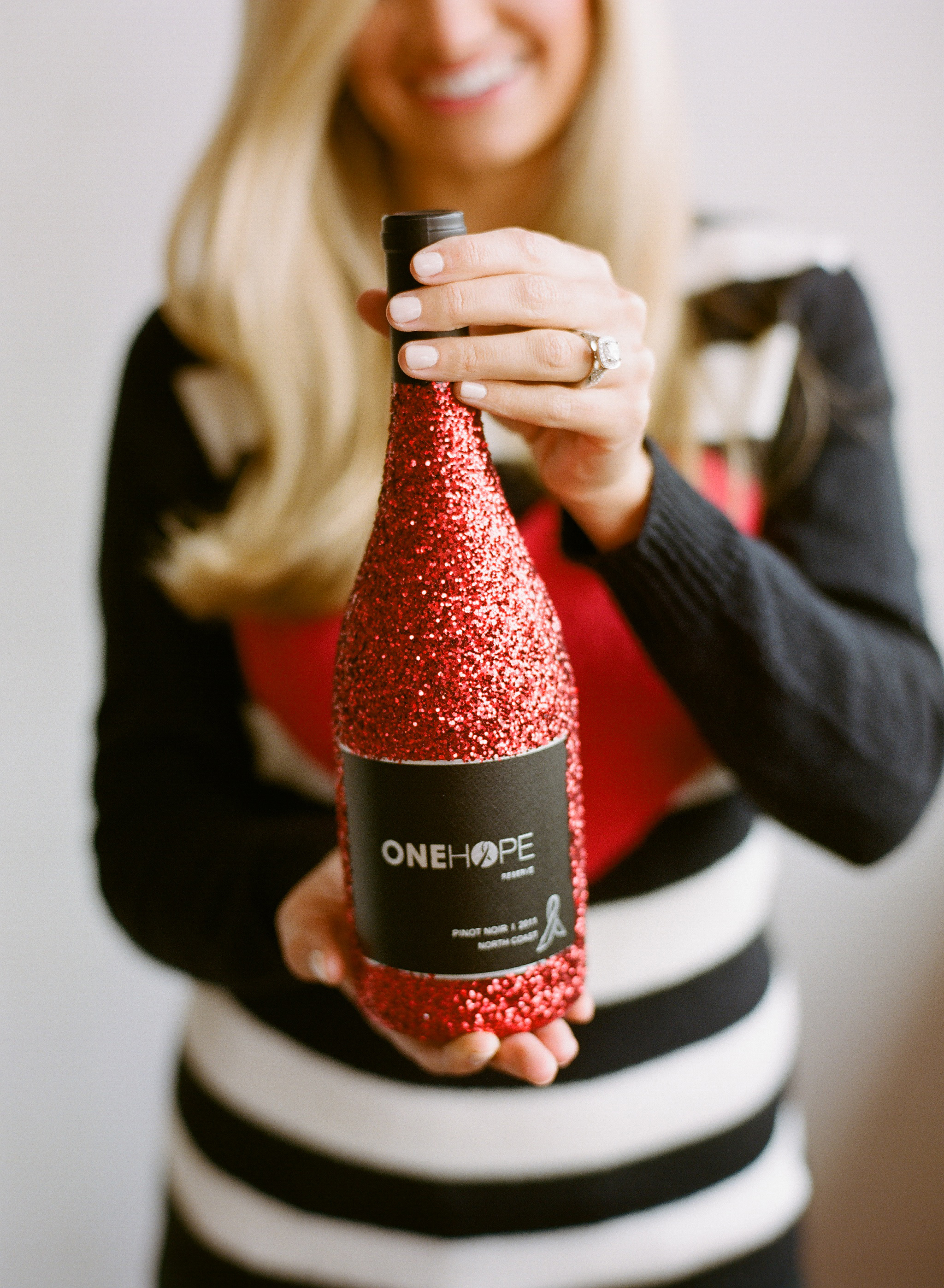
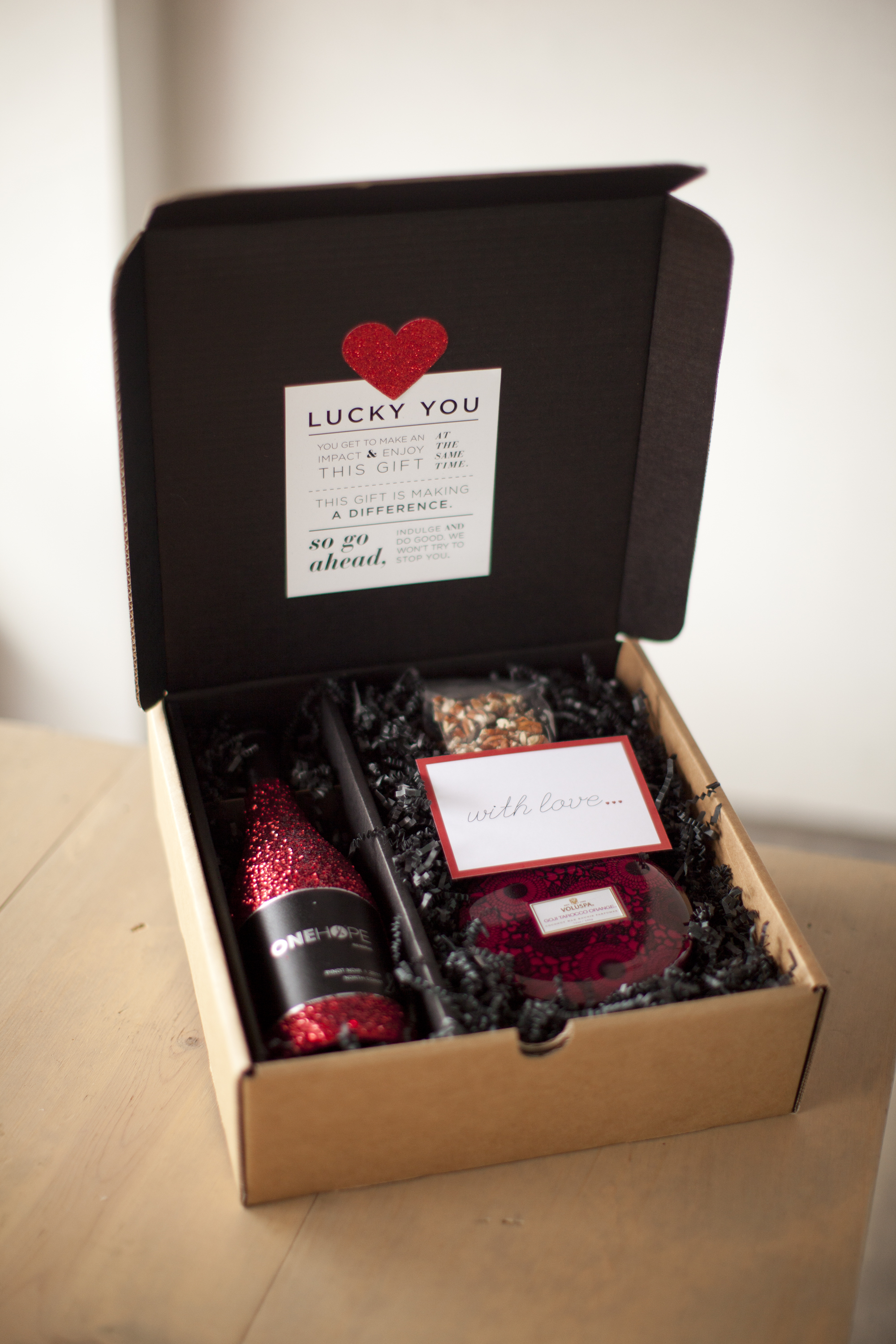
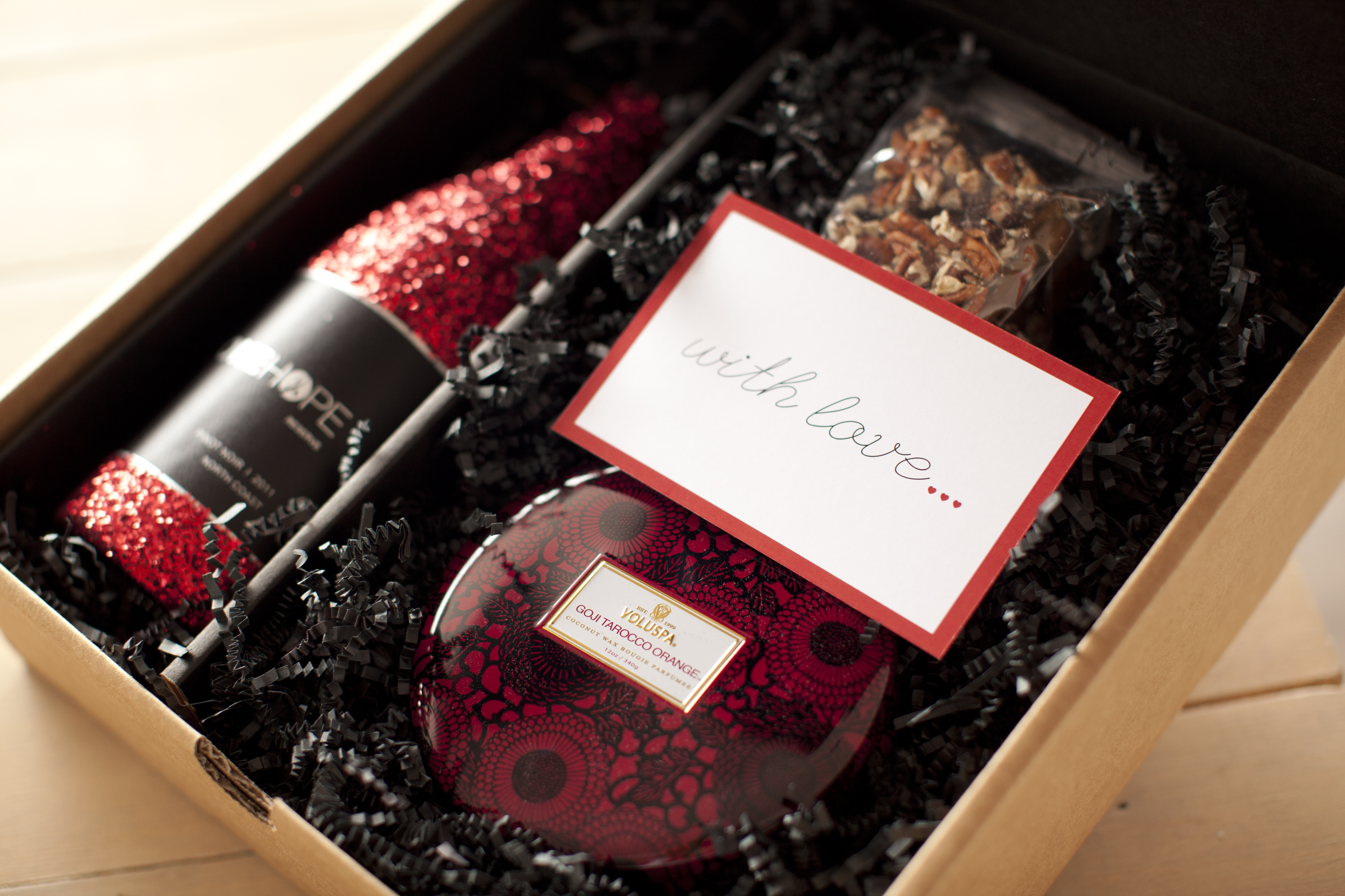
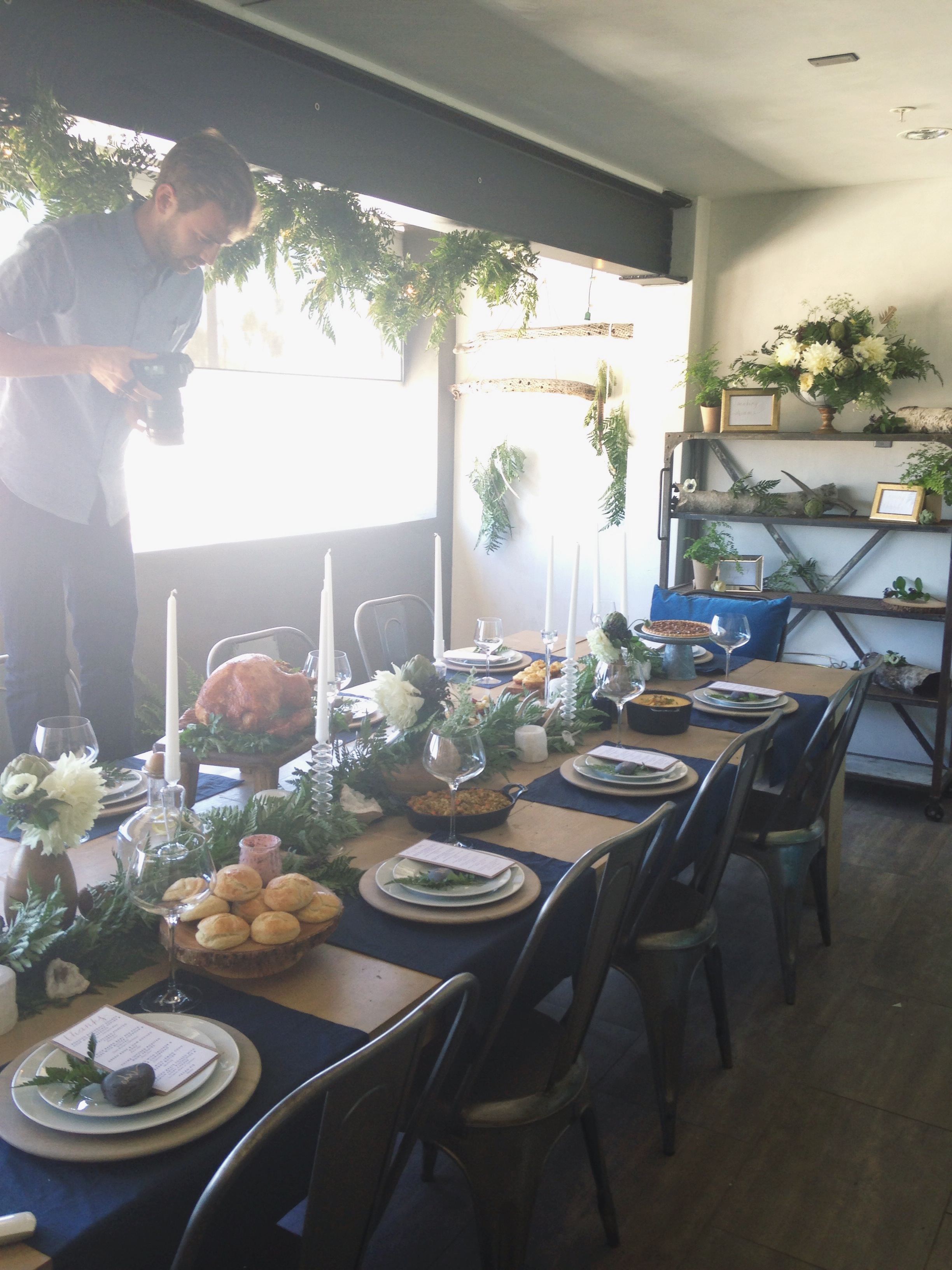
Happy, happy Monday!  I hope your week is off to a wonderful start!  Last Wednesday we had our “Christmas in July” / ONEHOPE Holiday shoot for ONEHOPE and the days leading up to it were an absolute blur.  From planning to flower arranging and driving all over LA to pick up rentals, it was a chaotic week!  While I’m glad to have the stress of it behind me, seeing everything come together for just the few hours of shooting sometimes doesn’t feel like enough.  Our table scape ended up being so beautiful that I couldn’t bear the thought of tearing it apart for a few days… even if it meant we had some wilted dahlias and crispy ferns as eye sores for Thursday and Friday.  If you follow me on Instagram, I’m sure you’ve already seen a few of these, but I just wanted to pass along some snippets of last week.  Can’t wait to share the professional images (hopefully this week) as well as some of the inspiration behind the day 🙂

Cheers!

photo 2

photo 3

photo (9)

photo 4

Design, Dine, Events, Floral, Wine Tagged With: christmas, decor, design, entertaining, event design, fall, holiday, home, instagram, iphone photos, photo shoot, table scape, thanksgiving, winter

Wine Wednesday | Radiant Orchid Granita

July 16, 2014

IMG_3474

Happy #WineWednesday! You know those projects that come across your desk and you just cringe at the thought of having to tackle them?  This one was it for me. I honestly can not remember being so stuck creatively – ever. When Pantone announced its color of the year for 2014, a part of me died inside. To go from Emerald Green (hello, best color EVER), to a bright purple hue inspired by my least favorite flower on the planet, seriously bummed me out. Fast forward a few weeks into 2014 and our PR firm was asking for us to whip up some sort of Radiant Orchid concoction. WHY.

I spent forever trying to figure out a way to make this happen.  I knew whatever wine we used needed to be virtually colorless (Sparkling) and that there needed to be some sort of mixer that was a borderline unnatural shade of purple to make the entire look come together.  I can’t say I’ve ever tested, tried and mixed so many ingredients in my life to make it happen, but it finally worked and I was floored with the results.  Of course the primary ingredient ended up being one simple, pretty natural thing – Blueberry Lemonade.  Seriously?  After all of that?!

You know how they say your greatest challenges often wind up being your biggest rewards?  This one was it.  I could not be happier with how it turned out.  Thank you, amazing PR firm for challenging me to think outside of the box… you girls absolutely rock 🙂

Check out a few of my favorite outtakes from the shoot and the full recipe below.  Cheers!!!

IMG_3239

IMG_3314

IMG_3344

IMG_3389

IMG_3395

IMG_3400

IMG_3403

IMG_3405

IMG_3412

IMG_3441

IMG_3447

IMG_3451

IMG_3474

Prep: 5 minutes
Total time: 3-6 hours

Serves: 8-10 (depending on glass size)

Ingredients
1 (750ml) bottle of ONEHOPE Sparkling Wine
1 liter blueberry lemonade

Directions
1) Pour blueberry lemonade into an 8″ x 8″ glass baking dish and freeze for 1-2 hours.
2) Carefully remove freezing lemonade from freezer. Using a fork, scrape the mixture until the consistency is slushy throughout (lemonade will be more frozen toward the outside edges of the dish when you start).
3) Put the mixture back in the freezer for 1-2 hours and repeat two more times. Scraping the mixture prevents it from freezing into a solid brick of ice and maintains the slushy, icy consistency that is so delicious about a granita 🙂
4) Scoop granita mixture into glasses (we used champagne coups) and top with ONEHOPE Sparkling wine. Cheers!

Wine Tagged With: bubbly, champagne, color of the year, cooking, design, DIY, foodie, granita, in the kitchen, kitchen, mixologist, mixology, pantone, radiant orchid, recipe, sparkling

DIY Fringe Backdrop

June 18, 2014

Mix&Muddle-12

I LOVE a solid DIY with pretty turn-key results and this one is just that!  When our EVP of Sales, Tiffany, asked for my help throwing her adorable little girl’s 1st birthday party, I knew we were going to have some fun 🙂  This was the perfect opportunity for us to debut our Mimosa Bar set (Shhh! Details coming soon!) and I was dying to create a cool backdrop that we could shoot everything up against.  This entire project took about 3 hours from Home Depot run to finish so I’m thrilled with what we were able to create in such a short amount of time.

Fringe-Backdrop-DIY

Supplies

Tissue paper in assorted colors
Panel Board
2- 2×4’s (8ft.)
Drill
Screws + Bolts (I used 2″)
Staple Gun + Staples (light duty)
Measuring tape
Paper chopper

Instructions

Before you begin your backdrop, determine how large it needs to be.  We wanted ours to be 8′ tall and to line up with the entire width of Tiffany’s buffet table (~60″).  Knowing that, I purchased 2 pieces of panel board (as one wouldn’t be big enough to cover the entire surface area between the top of the 8′ 2×4’s and the top of her buffet (~5′-6″).  I had the panel board cut to size at Home Depot and we were ready to go!

1.  Once your supplies are home, lay out the panel board and the 2×4’s and make sure the panel board is square with the legs.

2.  Drill large enough holes through the 2×4’s and into the panel board for your screws to slip into, but don’t attach the legs yet (that will be your last step).

3.  Remove the legs from your workspace to get them out of the way and determine how thick you want each row of fringe to be.  We decided that we wanted each layer of fringe to be about 8″ tall which perfectly worked out to be 1 piece of tissue paper folded long ways (hotdog style).  We didn’t want to be able to see the wood panel board when the fringe blew, so we layered each row first.  Starting at the BOTTOM of your board, fold 1 piece of tissue paper in half (so that you have two layers and staple it in place).  It might take 2-3 pieces of tissue to make it all the way across your panel board.  Don’t worry about the seams – no one will ever see them once you have covered up this layer with fringe 🙂

4.  Create your fringe layer and apply.  To create the fringe, we took 2 sheets of tissue paper, folded them hotdog style (so that we had 4 layers of tissue) and using the paper chopper, we sliced the paper in 1″ sections.  Be sure to stop slicing about 1-2″ from the crease.   This was the most time intensive part of the project.  However, using a paper chopper will make the process so much faster and will make your fringe even and much more professional looking 😉  Apply your fringe with a staple gun (across the top along the crease) and repeat all the way across.

5.  Once you have applied your first row of fringe, repeat steps 3 and 4.  Just a little tip… we thought it looked best if we covered up the top inch or so of the previous layer of fringe with our next color of tissue (see picture for detail).  That way, the transitions aren’t so harsh between colors and you cover up any inconsistencies along the top (below the crease) with the cuts you did to create the fringe.

6.  When you’re ready, carefully stand your panel board up with another person.  Be careful not to step on any fringe… it will tear off SO easily!  It might be easiest to lift your board slightly and slide the legs underneath to attach them.  Either way, just be careful not to tear or crease any of your pretty fringe.

Put your backdrop into place and….voila!!!  I can’t wait to share the images from the full party!  We were covered by Style Me Pretty Living and the feature is the absolute cutest!

PS:  The Mimosa Bar in the pictures can be purchased here, but more on that later too 🙂  xo

Mix&Muddle-17


Events Tagged With: birthday party, color, decor, design, event design, events, fringe, home, pink

Sparkle and Hearts

February 6, 2014

92140014

OneHope_Vday_0054

OneHope_Vday_0056

I’m so excited about a big project I just wrapped up for work!  Our limited edition All You Need is Love (and Wine) gift set is available exclusively for Valentine’s Day!  The bottle of reserve North Coast Pinot Noir is covered in ruby red glitter and is paired with hands down the best dark chocolate toffee on the planet, B.Toffee.  To keep things romantic, a 3 wick Goji Tarocco Orange scented candle by Voluspa is also included and smells SO good, you guys!  Plus, how pretty is this all put together?!  I absolutely love it!

Being that we’re supporting the American Heart Association’s Go Red for Women campaign during the month of February, we’ve committed to donating enough per package to educate 50 women on heart disease prevention.  Heart disease causes 1 in 3 women’s deaths, killing approximately one woman every minute.  CAN YOU BELIEVE THAT?!  1 in 31 women dies of breast cancer, while 1 in 3 dies of heart disease.  As a woman with heart disease in my family, I was floored when I heard those statistics and I’m thrilled to be working with such an amazing organization.  Today is the last day for east coasters to order and guarantee delivery by Valentine’s Day so be sure to head on over here to check  it out (and enter GORED at checkout for 30% off).  I’m swooning over the rest of the gorgeous images from this shoot with Lisa from L Marie Photography, but can’t share any more until they’re published.  I’ll be sure to post some more as soon as I can and just wanted to pass along some sneak peeks!

With love (and glitter),

Meg

Design, Wine Tagged With: design, my work, packaging, photo shoot, photography, product packaging, sale, styling, valentine, valentine's day, vday, wine, work

High Low – Spindle Chair

January 21, 2014

High-Low-Spindle-Chair
One of my favorite pass-times in Los Angeles is running or walking along The Strand in Manhattan and Hermosa Beach.  I think the beaches in LA’s South Bay are hands down the most beautiful in the area as the terrain changes from completely flat to hills and bluffs with roughly 100 yards of sand before the water.  The South Bay is probably one of my favorite places in the world and keeps me calling this crazy city home on the days when I’m ready to throw in the towel and move to New York… or San Francisco… or Austin 😉

Aside from walking or running from a fitness and sanity-saving perspective, it’s also where I go to recharge and look for inspiration.  I love looking at the varying architecture of the homes on the beach from total shacks (that are merely investment properties waiting to be cashed in), to ultra modern, to Mediterranean, to grey and white Cape Cod beauties.  There is one home in particular that I pass often with NanaWalls that completely open up to the ocean.  On the days when the residents are home and have the doors open, I always take a quick peek at their absolutely stunning, elegant, beach-inspired decor.  In their family room, situated around their gorgeous coffee table is a white sofa (I die) and four spindle chairs.  Spindle chairs are so versatile, but look exceptional when they take residence in a light and airy coastal home.  After one of my morning walks, I decided to look them up… just a little research for our hopefully future home 😉  From Williams Sonoma at a striking $1,295 to ZGallerie at a significantly lower $599 (+ $299 ottoman if you’re interested), the range was substantial and a reminder to always look for a better deal.

Happy deal hunting!!! <3

Design, Interiors Tagged With: beach, chair, deal, design, hermosa beach, high low, interior design, la, manhattan beach, south bay, spindle chair, williams sonoma, zgallerie

Style At Home

January 20, 2014

Paul Katie Hackworth Rue

People ask me all of the time to define my style and I have a really hard time putting it into words.  Some days I’m really into mid century modern while on others, I’m craving a transitional home fit for a vineyard in Napa.  Beach chic?  Vintage chic?  Eclectic?  Those all seem so broad and non-descriptive.  When I came across this image in the November edition of Rue, I could not stop staring at it.  It’s the dining room of Paul and Katie Hackworth and is everything I love about design all in one space: bright, airy, crisp, neutral, white exposed beam ceilings, a farmhouse table with amazing patina, wingback upholstered end chairs with nailhead detail juxtaposed against the chic and timeless Philippe Stark Louis Ghost Chair… and of course a little splash of life in fresh greenery clippings throughout.  Their “modern farmhouse” is completely and utterly perfect.  The home’s comfort-meets-clean-lines aesthetic left me speechless and I find myself repeatedly pulling up the images whenever I’m suffering a design block and need to push the restart button.  It truly is simplicity at its finest with a real soul and a perfectly imperfect lived-in feel.  I can’t wait to have a house of my own one of these days and theirs leaves me truly optimistic and excited for the future.

Check out their Rue feature here and prepare to fall in love.

Design, Interiors Tagged With: country, design, farmhouse, feature, home, interior design, life, living, photography, rue

Office Inspiration

November 7, 2013

Color-PaletteAs much as I love the black executive suite at our office, the marketing team’s space on the top floor is collaborative, bright, airy, open and white… which is truly my go-to aesthetic.  It’s hard to believe that it’s been over a year since we moved into our space and within that year, we’ve inevitably had everything from boxes to paper samples to glass samples, ribbon – you name it – pile up… everywhere.  I took a day this week to de-clutter my personal work space and I was shocked at what an unbelievable weight was lifted off my shoulders.  I actually WANT to get to the office early, light a candle, put on some tunes and get creative.

Around the same time, I’ve been stalking admiring Emily Henderson’s latest project (isn’t she seriously THE BEST?!?!) and being that my color palette right now is basically mint/sea foam green, white and flax, I realized how insanely easy it would be to integrate some of the warmer blush tones and a hint of raspberry or coral to spruce things up.  I finally pulled the trigger and ordered some art that I’ve been wanting forever and can’t wait to pull everything together hopefully next week 🙂  Below is a little inspiration board I threw together… What do you think?

Office-Inpsiration

love print / made by girl
greek key pillow / caitlin wilson textiles
monique lhuillier / blush champagne coupe
french cade lavendar candle (favorite candle ever) / voluspa
do good print /sugar paper
faux sheepskin / ikea
hold the phone / fab
gold polka dot pillow / caitlin wilson textiles
peonies in a vase / minted

Design, Interiors Tagged With: art, black executive suite, blush, career, color palette, design, desk, Emily Henderson, grey, ign, inspiration, interior design, office, office space, pink, white, work

Wine Wednesday (HalloWINE Style)

October 30, 2013

When one of our co-founders at work suggested that we put an adult spin on Halloween and pair our wines with classic trick-or-treat candy, I was game.  She conducted a tasting and figured out which flavors would work the best with one another before passing it over to me to style and shoot.  The office was FULL of goodies yesterday so we all did our own little tastings and they were AMAZING… Some of the pairings were really different and unique so I didn’t expect to like them all as much as I did, but I guess you really can’t go wrong with candy and wine!  It was tough to pick a favorite.  Thought I would pass these along for a little Halloween inspiration in case any of you wanted to give it a whirl on your own!  And I know it might be tempting, but try not to eat all your kids’ Halloween candy 😉 Cheers!

DWD-Hallowine-Sparkling-Final

DWD-Hallowine-Sauv-Blanc-Final

DWD-Hallowine-Chardonnay-Final

DWD-Hallowine-Pinot-Final

DWD-Hallowine-Merlot-Final

DWD-Hallowine-Zin-Final

DWD-Hallowine-Cab-Final

Dine, Wine Tagged With: candy, cheers, chocolate, delicious, design, food, halloween, hallowine, home, kitkat, photoshoot, pumpkin, skittles, snickers, stylized, vino, wine, wine pairing, wine tasting

Words of Wisdom

October 23, 2013

anything-final

I’m a huge fan of Bri Emery over at DesignLoveFest and her “Dress Your Tech” series is my absolute favorite.  I LOVE this desktop put together by Lauren Essl and it’s available as a free download over on Bri’s blog.  Simply put, these words of wisdom came when I really needed it most.  More often than not, I’m running at 100 miles per hour (October has been a complete blur) and I find that I beat myself up over absolutely everything – not responding to an email fast enough, not working out enough, not getting to the office early enough…  I think it’s imperative to constantly strive to create the best version of yourself, but it’s also so important to remind yourself every once in a while that you are enough.  You can not do everything and all anyone expects of you is for you to do your best.  Whenever I find myself wallowing in self doubt and on a downward spiral of feeling like I’m not enough, it’s usually my wonderfully honest and direct boyfriend reaffirming what I’m already feeling.  He has a really keen sense of when I’m headed into one of these lows and is so amazing (although I don’t always appreciate it) at letting me know to take a moment for myself to clear my mind.  I’ve realized that what sends me to this point is usually an overall lack of writing down my goals and keeping lists of what I want and need to accomplish.  Trying to organize it all in my mind simply doesn’t work for me when things get hectic.  I’m looking forward to taking a step back with some time to reflect this weekend in Michigan.  The good ole’ midwest always knows how to put things in perspective for me 🙂

What do you do to help remind yourself to slow down?

Design, Life Tagged With: busy, calligraphy, design, graphic design, life, live, self esteem, tech, technology, typography, work

Fall Cocktail Shoot – Sneak Peek

October 21, 2013

IMG_9806

Eeeeee!  Our cocktail shoot from Friday went SO well and while we still have a few more looks to shoot today, I couldn’t help but share one of my favorites.  I have a well documented obsession with Carrara marble and recently picked up one of these French Pastry Slabs for my new place.  It serves as such a beautiful surface for styling and I knew we also needed one for shoots at the office.  I couldn’t possibly be more excited with how insane it makes the ingredients pop.  I’m so used to shooting directly on our huge farmhouse table, which is great when you’re going for really rustic, but I wanted to chic things up a bit and this made all the difference in the world.  Keep in mind, we haven’t edited a thing yet, so this is just a raw image.

Ok, ok and one more… 😉

IMG_9934

Happy Monday!

Design, Dine, Wine Tagged With: Carrara marble, cocktail, design, food styling, oranges, photography, styling, wine

  • « Previous Page
  • 1
  • 2
  • 3
  • 4
  • …
  • 7
  • Next Page »
  • Facebook
  • Instagram
  • Pinterest

Search

About Meg

subscribe via email

Insta Love

Shop Pillows!

Recent

  • Late Summer Gazpacho
  • 2018 Harvest Party
  • Life Lately: Golden Hour
  • Sauvignon Blanc Harvest / 2017
  • Fig + Prosciutto Salad with Almond Milk Ricotta

Favorites

Follow Along!

  • Facebook
  • Instagram
  • Pinterest

© Copyright 2025. Design.Wine.Dine.. All Rights Reserved. Design by Bloom.